Writings
Selling Decor in a Flash
In a recent Mashable.com article, Lauren Indvik described how several flash sale (daily deal e-commerce) websites are testing out TV advertising. (http://mashable.com/2012/10/12/onekingslane-tv-commercial/) The article highlighted high-end home decor website OneKingsLane.com for their newly-minted spots that focus on the theme “Design is Never Done.”
[youtube http://www.youtube.com/watch?v=YN8faU8A0qg&w=560&h=315]
While the TV spots have just begun to air, and they part of a larger campaign, it is clear that ad agency Wieden+Kennedy has crafted the message to thoughtfully address the unique problems of a flash sale home decor retailer. The items sold on flash sale websites are only available for a limited time. This is great for creating a sense of urgency and convincing the customer to buy NOW. It does, however, make it harder to sell the customer add-ons that match their primary purchase.
Common Challenges of Selling Furniture
Conventional, brick and mortar furniture retailers make the most of their customers by adding on to a primary purchase with matching and coordinating items. Like the bed? Then why not get the dresser, nightstand and chest to go with it? This is harder to do on a self-service website where there is not a sales associate to suggest the pieces to complete the room. On One Kings Lane, items are presented individually, leaving the consumer to choose items that suit their fancy. It’s a great approach for customers confident enough to curate their own eclectic style. But those who are less confident may feel unsure about how their selections will work together in their home.
The purchase cycle for furniture is long-term, with bigger ticket items, like a sofa or a mattress, being purchased once every five to seven years. It’s a challenge for brick and mortar furniture stores to bring a customer back in when they are not in an active search. I anticipate that this might be an even greater challenge for a home decor flash sale website.
In any marketing campaign, many variables contribute to the overall impact. As an outside observer of the beginnings of this campaign by OneKingsLane.com, I can say that their messaging does a good job of addressing some of the inherent challenges of the business.
Content Pet Peeve: One Size Fits All
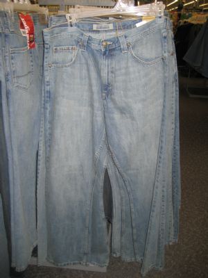
I recently looked at an article online that promised to divulge the best style of jeans for each body type. As I read through each jean style on the list, when the rhetorical question “Who can wear this style of jeans?” was written, the answer was invariably “Everyone!”
I don’t know about you, but I know I don’t look good in every jean style out there. I felt cheated after reading the article. My time was wasted. I went seeking denim enlightenment, and ended up no better off at the end of the article.
On occasion I have felt the same way when reading the copy in furniture ads, specifically when I get to the phrase that says “perfect for any room.” Not every piece of furniture is perfect for every room and to suggest so in ad copy does a disservice to the customer. As a marketer in the furniture industry, the goal is to sell furniture and I understand the impulse to negate any objection that the customer might come up with. But as a thinking person with a decent sense of style, I know that not every piece will fit any room. Marketers and copy writers shouldn’t waste the customer’s time and insult their intelligence by claiming functional and stylistic versatility that isn’t there.
Now is the Time for a Little Judicious Flag Waving
As we approach Memorial Day weekend mailboxes, physical and virtual, will be stuffed with flyers, postcards and emails proclaiming “Memorial Day Sale.” What has surprised me this year is the number of Memorial Day ads that have appeared sans the traditional red, white and blue.
I will be the first one to tell you that as a consumer, I can’t stand glib, bombastic, hyperbolic advertising. I once argued with a creative director over the headline “Greatest Value in America!” My point to him was that as part of target demographic for the merchandise being advertised, that the statement meant very little to me because of the over-the-top marketing rhetoric was not to be believed. Personally, I would be more swayed by a more specific value proposition that was relevant to my life. I really don’t think I am too different than other women who make decisions on where to shop and what to buy.
The tradition of “boraxed” patriotic-themed holidays is well established and frequently over-done. A recent mattress circular that came in the office newspaper was so packed with ribbons, stars and fireworks I couldn’t figure out where to look. I absorbed nothing about the ad other than it was red, white and blue. Granted, mattress advertisements are particularly prone to the starburst approach to advertising, but when everything in a ad is emphasized, nothing has emphasis.
In contrast to the clownish approach to advertising with patriotism stands the ad series from Chrysler that debuted earlier this year during the Super Bowl, featuring rapper Eminem. The ads and anything but glib. They speak to the strength of American character, recognized the challenges we have faced as a country and pay tribute to the pluralism of our citizenry.
When you consider the recent death of Osama Bin Laden and continued economic concerns that are, in part, tied to the US’s trade imbalance, doesn’t it seem like a good time to wave the flag a bit ads featuring products made in the USA? We’ve all felt beaten up as a country the past few years. Let’s put political rhetoric aside and feel good about who we are as a country. It’s okay to wave the flag in your ads if you do so with sincerity.
Perfectly Imperfect: Ethnic Designs in Modern Interiors
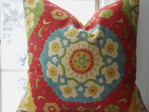
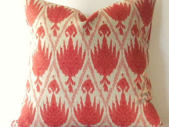
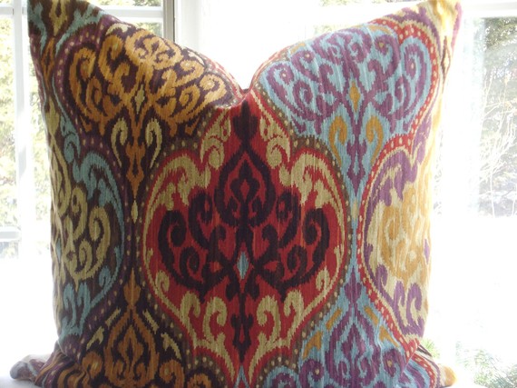
Over the past couple of years two kinds of traditional textiles from non-western cultures have been imitated by fabric designers for upholstery and home decor markets: Suzanis and Ikats. Both of these ethnic influences appear very fresh in modern interiors.
Suzanis are ornately embroidered textiles made in several Central Asian countries. These elaborately decorated cloths were presented as part of a bride’s dowry on her wedding day. The detailed designs of suzanis are very organic with motifs of leaves, vines, flowers and fruit. Floral-form medallions of suzanis have been the most imitated design elements.
Ikats are woven textiles from Indonesia. The threads used to make an ikat are bound and then dyed (same principle as tie dye) before weaving. When the threads are woven into fabric, the color variations created by the resistance dyeing make soft-edged, yet graphic, patterns in the finished fabric.
Both of these ethnic textile forms are being imitated by the designers of contemporary upholstery fabrics. The designs are graphic, but not hard-edged. The designs generally symmetrical in concept but intentionally imperfect in execution. Shapes are not razor-sharp, but irregular and seem to have been created by a rustic, tribal craftsman.
When these fabrics are used in modern decor they seem to serve as an antidote to the high-tech world we live in; they are not slick and hard-edged. They add color and interest like a touch of exotic spice to a traditional dish. More significantly, I think, these patterns can humanize a space by showcasing the beauty of that which is not perfect. They serve as a “Gods square*” to a room.
*Okay, this is another bit textile trivia: in some traditional religious communities handmade quilts are never made perfectly symmetrical. One quilt square is intentionally different from the pattern of the rest of the quilt. This different square is called the “God’s square” because only God can make something perfect. It would be considered an act of hubris for humans to try to make something perfect.
One Original TV Spot, Oh So Many Imitators
Two years ago Ethan Allen came out with an arresting new TV commerical. It consisted of quick cuts of stills featuring beautiful architecture, beautiful people, some beautiful furniture, and words such as “hip, cool, pretty, elegant, chic, sexy, fresh and modern.” The words appeared in white on a black background in a modern sans serif font. The spot did not use any voice over, only quick rhythmic music which matched the quick cuts. The spot ended with a question under the store name: got an appointment?
[youtube=http://www.youtube.com/watch?v=6743_i5FOZ4]
To my reading of it, it was an attempt to update their brand positioning. The mainstay of traditional high-end custom design wanted a younger, hipper client base. This coordinated with their ads in other channels which seemed to feature models and rock stars with lots of money and style. Who wouldn’t aspire to live like that? All you had to do as call for an appointment…
The spot spawned immediate imitators. I have seen more than one small independent retailer make their own version of the spot with varying degrees of success. The early copy cats served a similar clientele: high end custom furnishings with personal design service.
Two years later, the approach of this break-through spot has drifted and been diluted by lower-end home furnishings companies, and even a mattress specialty shop. I’m sure these companies went to their advertising teams and said that “We need something like that Ethan Allen commercial…” Utter lack of imagination (either by the advertising creatives or their clients) led to commercials that imitate the technique, without the same style impact. Please note the use of the word advertising, not marketing in this context. Yes, there is a difference. Advertising is a subset of the marketing function. Imitating the look of another company’s ad without understanding the strategic underpinnings shows a lack marketing acumen.
What it comes down to is that companies need to better understand what they stand for in the marketplace, and what their customers want. Creating an authentic brand voice isn’t easy; it takes work, but it is worthwhile. After all, who will stand the test of time the original or the imitator?


Recent Comments